How We Edit Our Instagram Photos + Flat Lay Tips
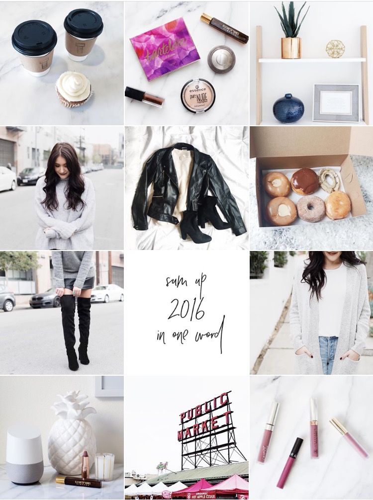
Instagram has become such a guessing game in recent months. You may think you’re putting out your best work only to be left with minimal engagement. While the algorithm change is frustrating (to say the least) Carli and I are still trying to maintain the look and feel of our feed, even if our engagement rates aren’t where we want them to be. To us Instagram is still a place to share snippets from our blog and our life and we enjoy creating an aesthetic that mimics who we are.
In the past year our Instagram has been all over the place. We didn’t really know which direction we wanted to take it. Did we want it to be bright and colorful, or cool and muted? We opted for the latter since you know most of our wardrobe is colorless and we have a small obsession with marble and gold, both of which are neither bright nor colorful.
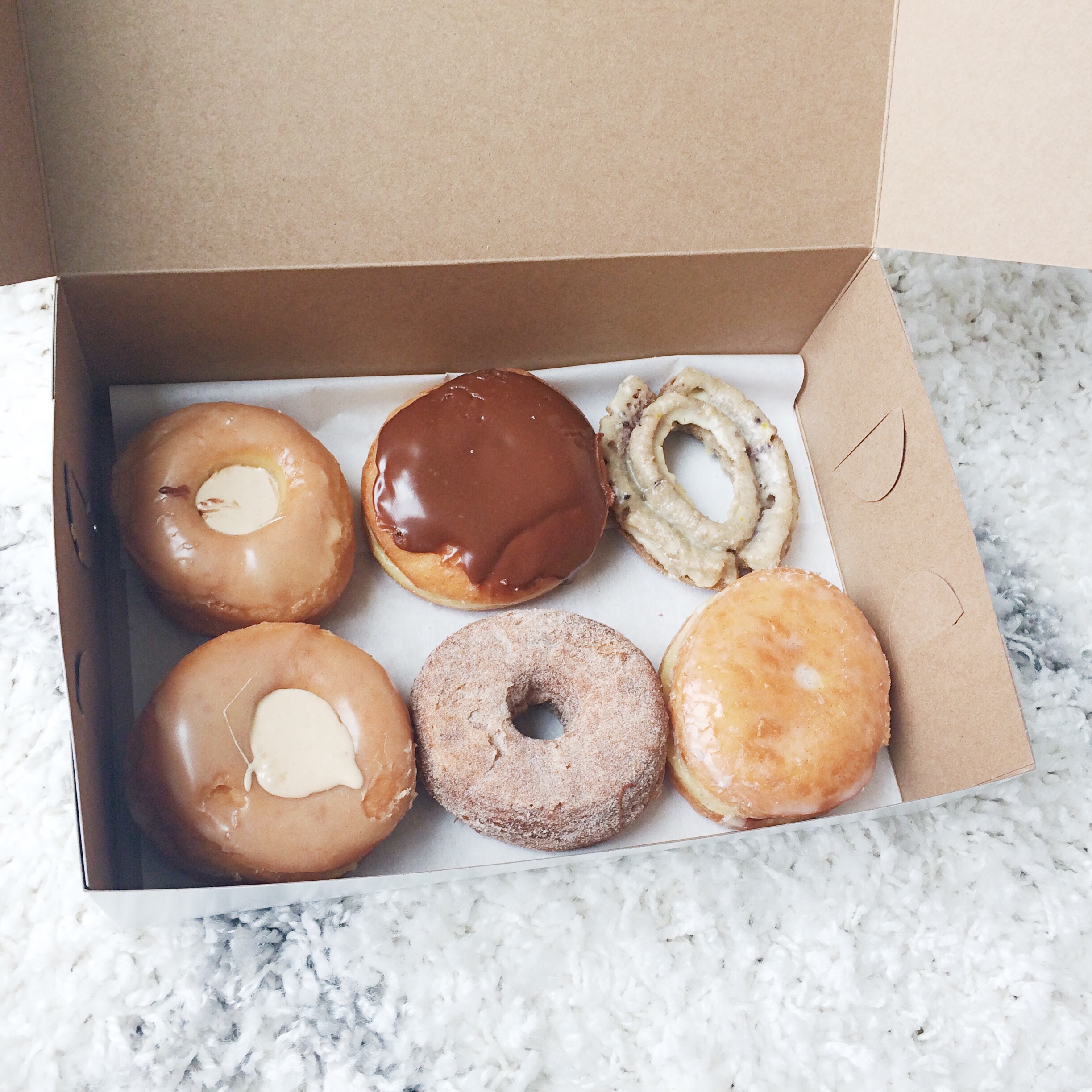
Once we decided what look we wanted to maintain we knew we had to pick a filter that we would use on EVERY photo we publish. This was definitely restricting in the beginning but then we learned which types of photos to take that would compliment our filter. The filter we went with was S2 by VSCO. S2 is part of the ‘Bright + Clean’ series which is exactly the aesthetic we were going for, so it was worth the $10 price tag. Yes, we had to buy the whole pack of filters to use ONE.
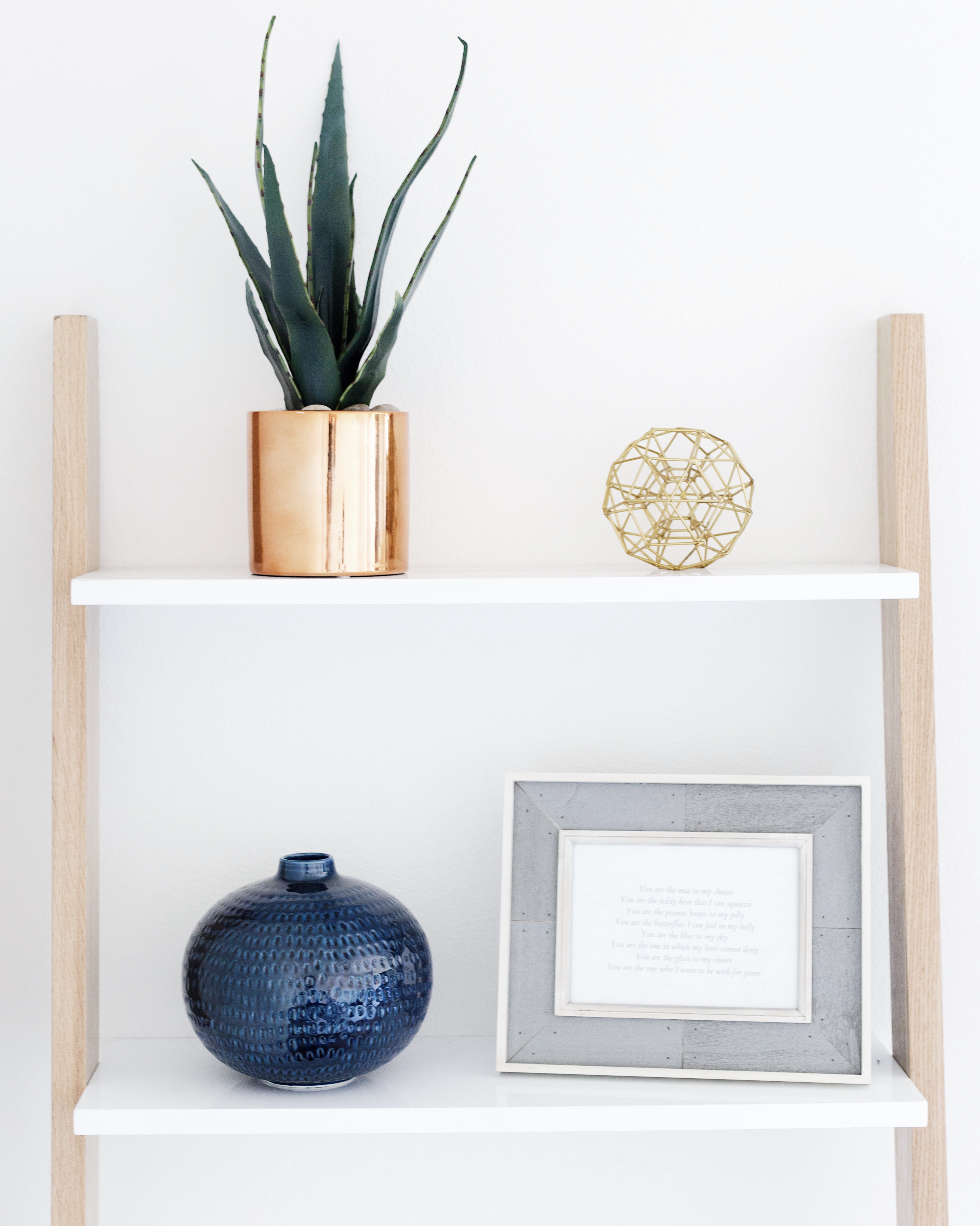
For our Instagram we like to have a lot of white space and cool tones. For some reason green looks really weird with S2 so we try not to incorporate any green tones, if possible. We ALWAYS use square photos. They look clean and uniform. It can be tough to square crop photos so we recommend shooting in square mode if you’re on an iPhone. If we’re using our Canon we’ll make sure we leave plenty of room to crop.
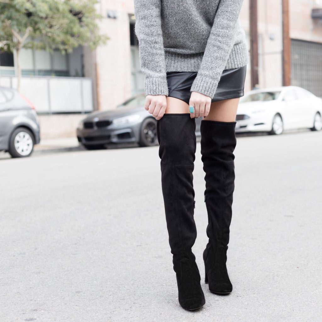

Once the photo is in a square we will upload it into VSCO and add the S2 filter, we never really use it all the way, we’ll stay around +7. After that we’ll open the normal controls and do the following: Sharpen +1, Temperature -1, Contrast +1. Obviously this wont work EVERY time, but we try to stick to these adjustments as much as possible. Sometimes we will up the exposure as well.
Once we have some photos ready to go we will plan out our feed. We never want “people” photos stacked on top of each other or right next to one another. One way we like to plan how our photos will look is with the UNUM app. UNUM lets you layout your photos and move things around until you have an order that you like.
So to recap, here are the steps we take when editing Instagram photos:
- Make sure your photo is square cropped
- White space is your friend
- Open the photo in VSCO, add the S2 filter. Bring it down to around +7
- While still in VSCO open the normal controls and move: Contrast +1, Sharpen +1, temperature -1. Sometimes you’ll have to adjust the exposure to make the photo brighter. Export the photo to your camera roll.
- Plan out how your feed will look in the UNUM app. Never stack similar looking photos.
Moving On…
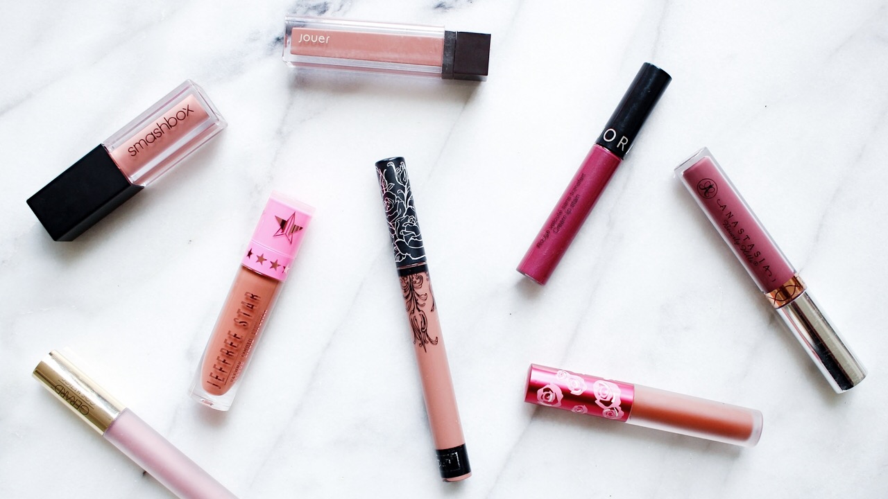
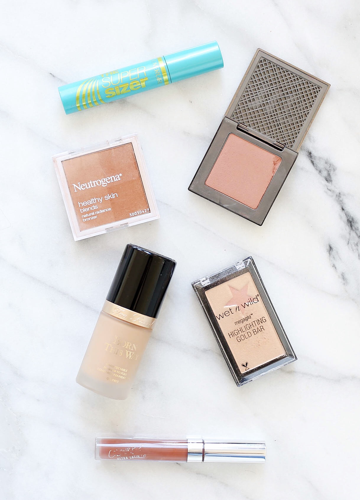
Flat lays. Flat lays are a bloggers best friend. Carli and I love to showcase our favorite makeup and food and the best way to do that is with a flat lay because they allow the products to take center stage. Your not distracted by other items in the photo. Flat lays can be hard to manage if you have a lot of products and not enough space.
When Carli and I first started experimenting with flatlays we invested in a Marble Pastry Board so that all our flatlays would be uniform. The board is large enough to fit all the products we want to showcase and is portable so we can move it around and find the perfect light. Overtime we’ve definitely learned what works and what doesn’t, so without further ado…
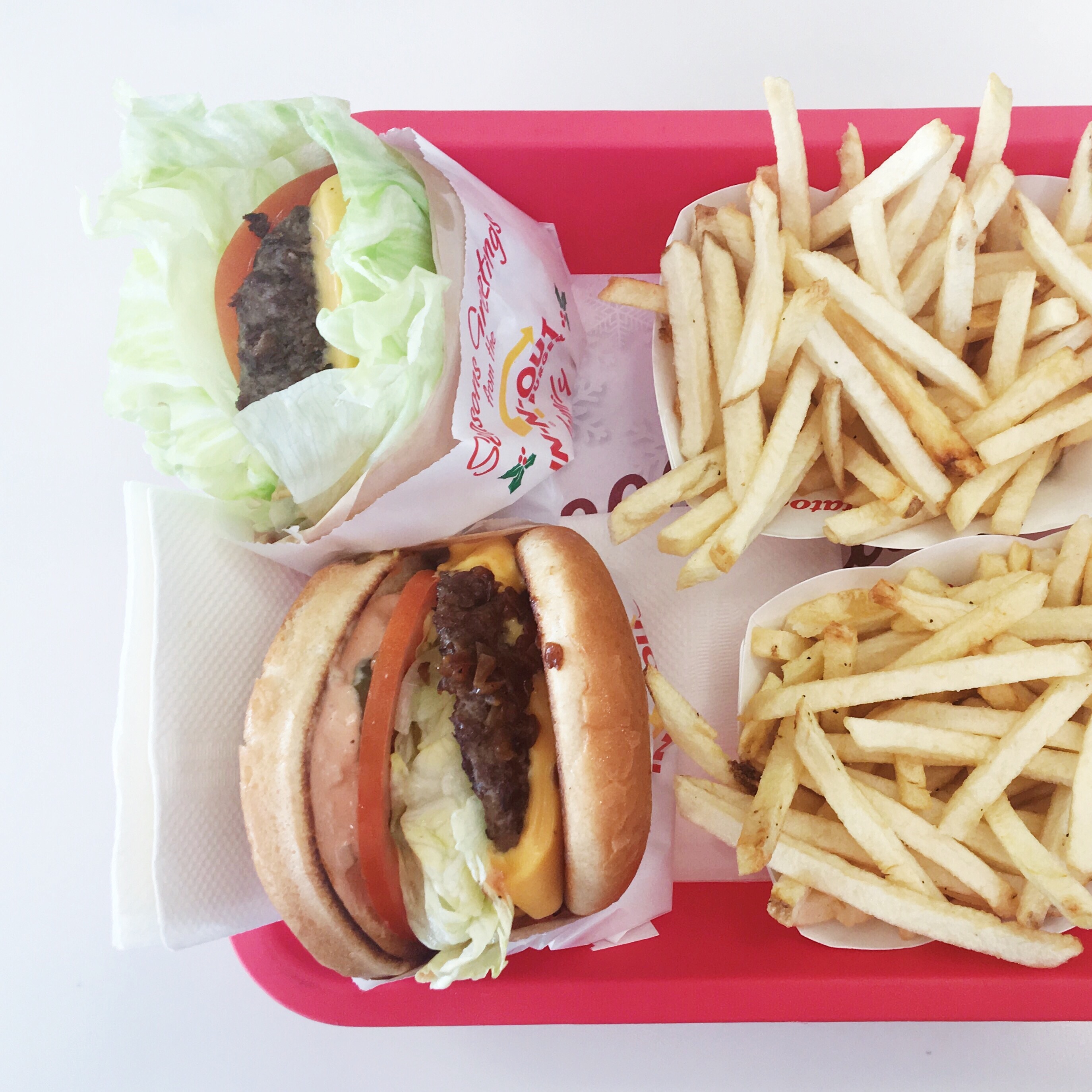
Here are some tips to make your flat lays stand out:
- Use a Marble Pastry Board since marble is subtle so it will showcase the products and not take away from them.
- Make sure all of your products are in the same color palette (ie. nude lipsticks)
- Place your board in front of a window or door so you have enough light to work with. You never want a dull flatlay
- Play with textures. Use a white faux fur rug or pink velvet to compliment your products while adding some dimension. You could even use your marble board along with some faux fur.
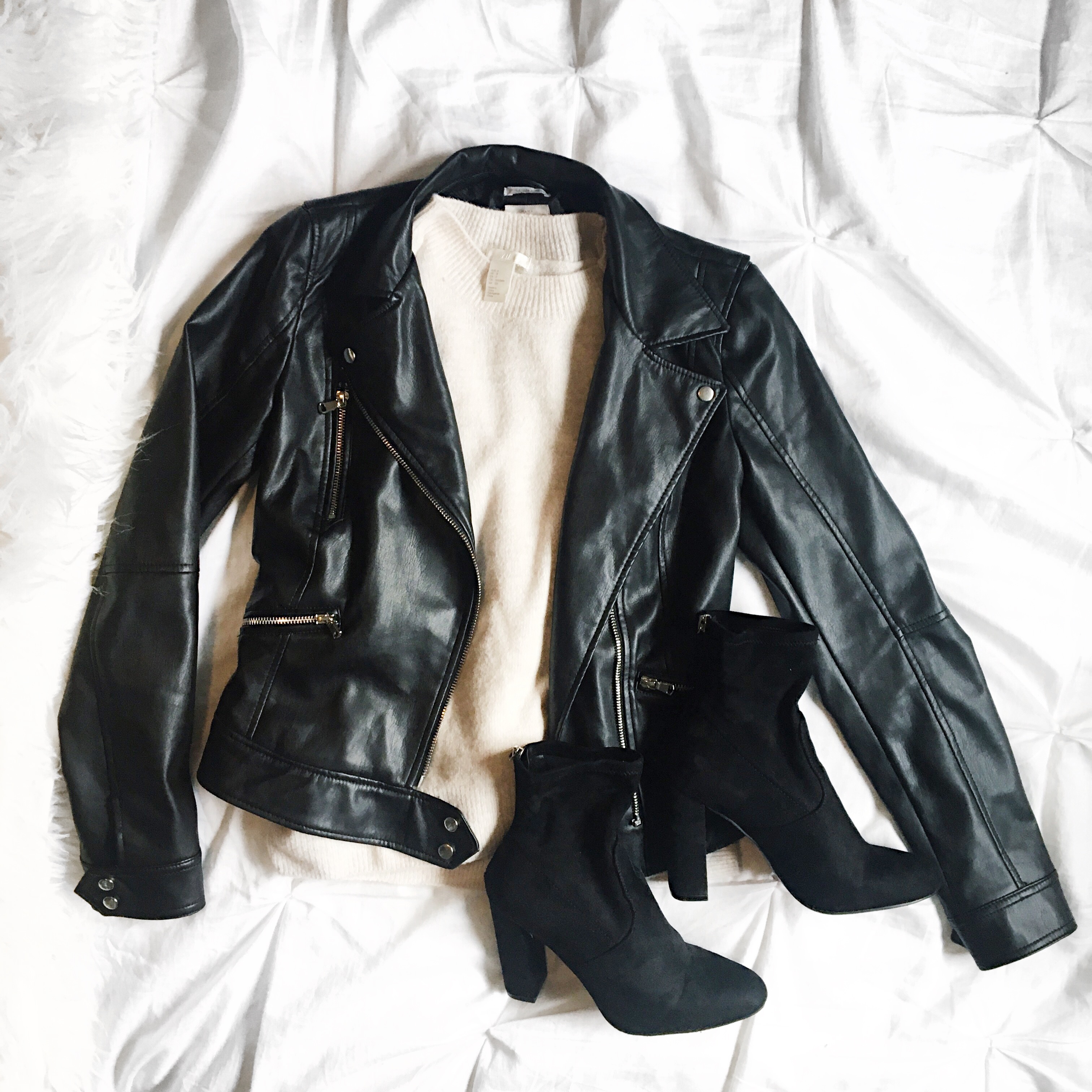
- Use what you’ve got. I have a white tufted comforter that actually works really well for clothing flatlays because its right in front of the window. Look around your house and find spaces that have plenty of space and are well-lit.
- Use different angles. If your products look weird shot directly overhead try another angle. Sometimes flatlays from more of a side view look really nice and more realistic.
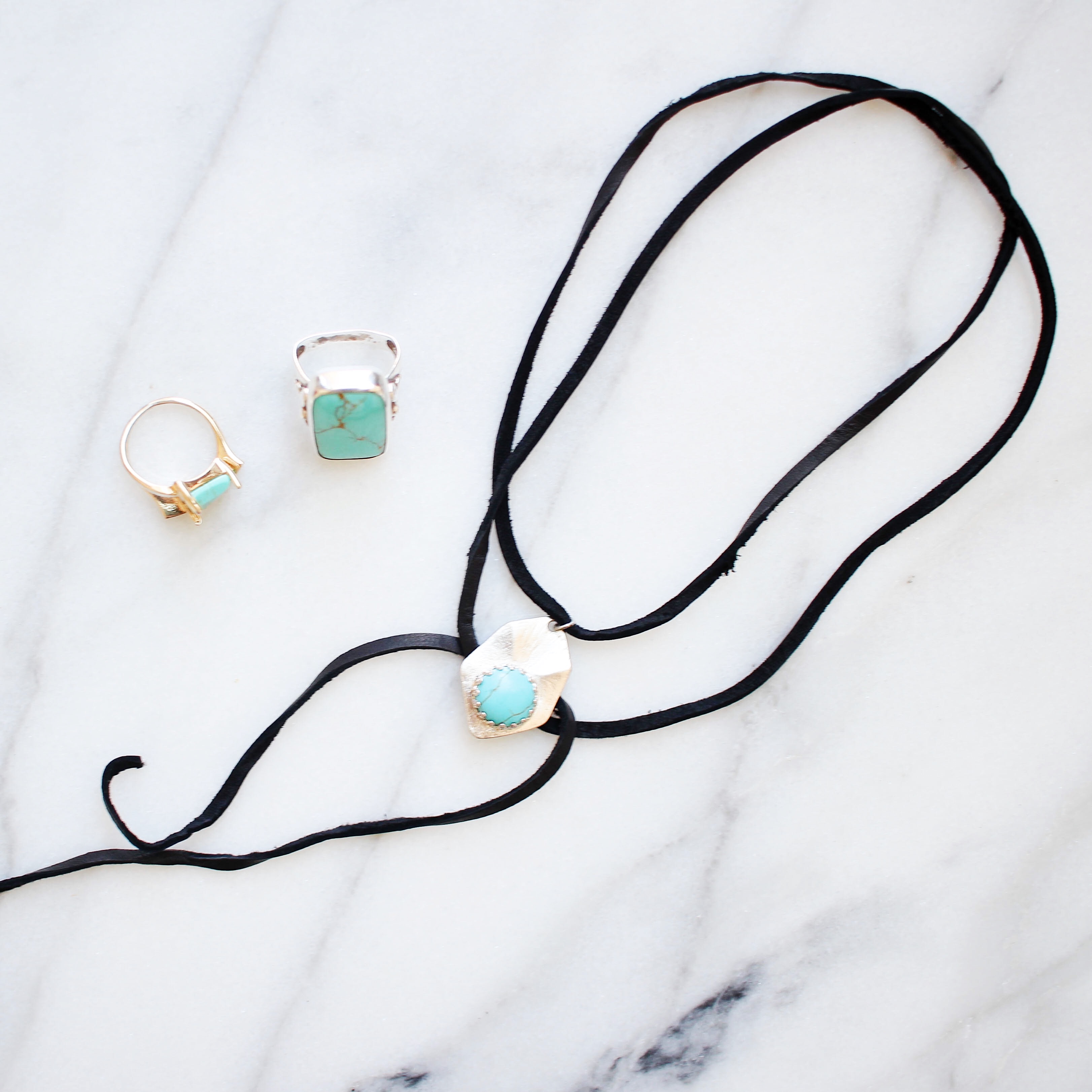
- If you want to do a flatlay that focuses on one item, try to incorporate similar items. We did a necklace DIY once and decided to add some rings to the photo so it’s not “boring.”
What is your favorite Instagram filter?
xx, Britta

Love your simplistic Instagram theme
Thanks Kate! xx
Such great advice. I really like the idea of picking one filter and sticking with it. I think I’m gonna start doing that 🙂
Thank you! It’s pretty easy to do once you get used to it!
I love how you dont have a lot of distractions when you post a photo. I love how the product you want to focus on is the one getting the attention. Great post, love the tips, I appreciate the fact that you added which settings to add.
I accidentally found your post. This is very good advice for beginners. Your have a very beautiful photos. Many thanks!