How to Revamp Your Living Room
The new year made us want to completely de-clutter our house and start fresh. We’ve been in our apartment for about a year now so it was time to get the living room together. When we moved in we bought a sectional but we still had random furniture lingering around. It’s nice to have the extra seating but we really want to make the room look like it’s curated.
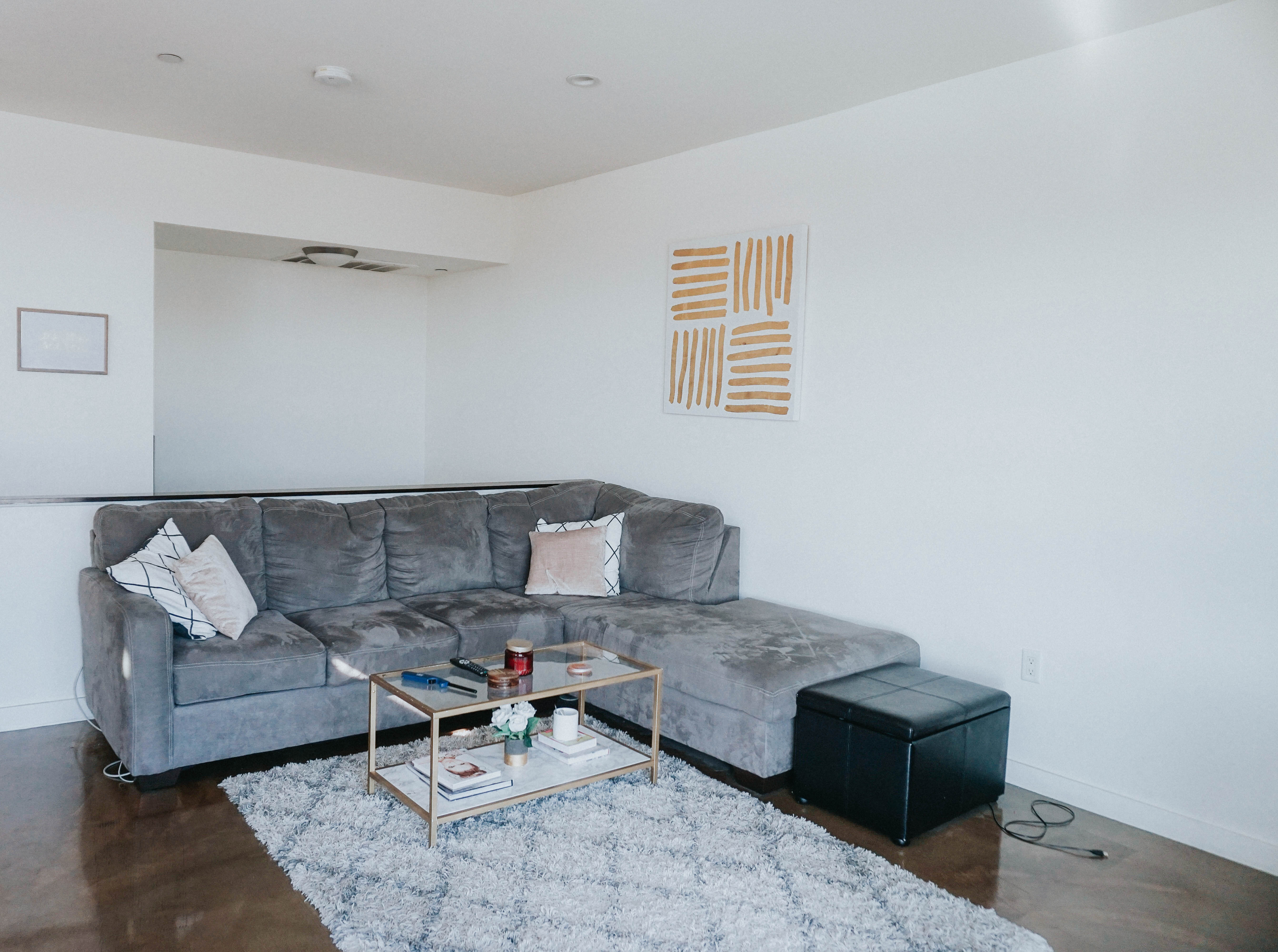
Here are some before photos:
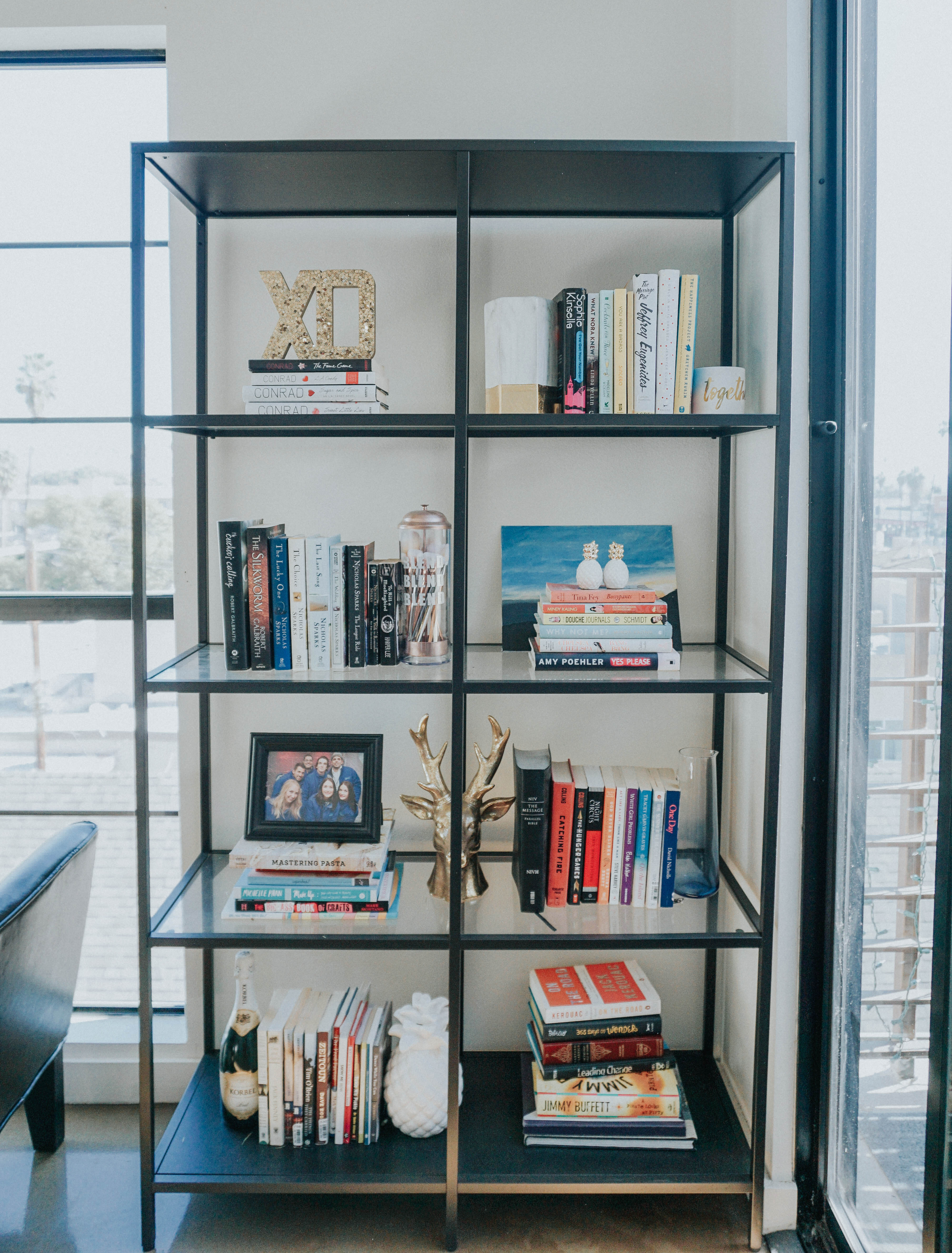
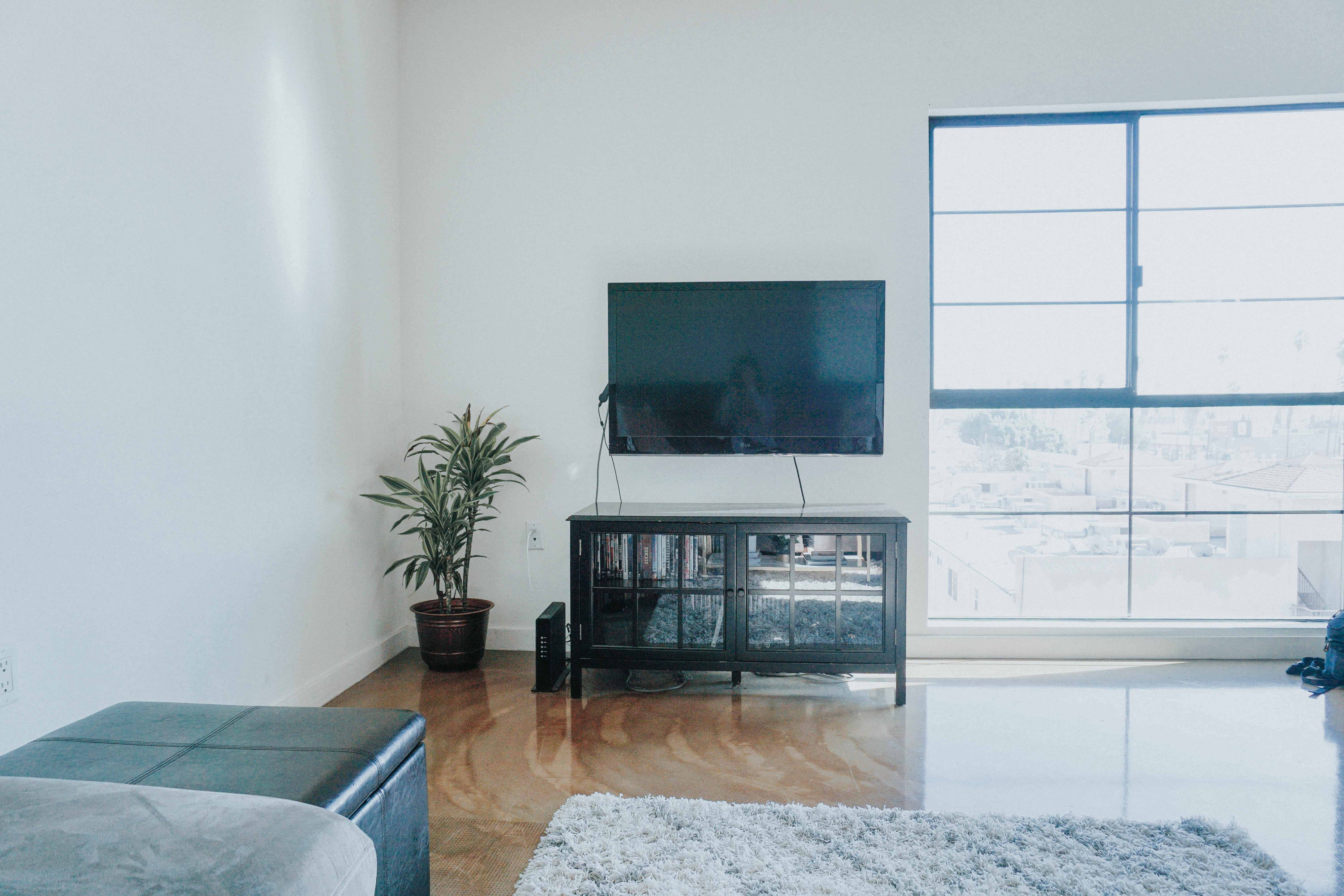
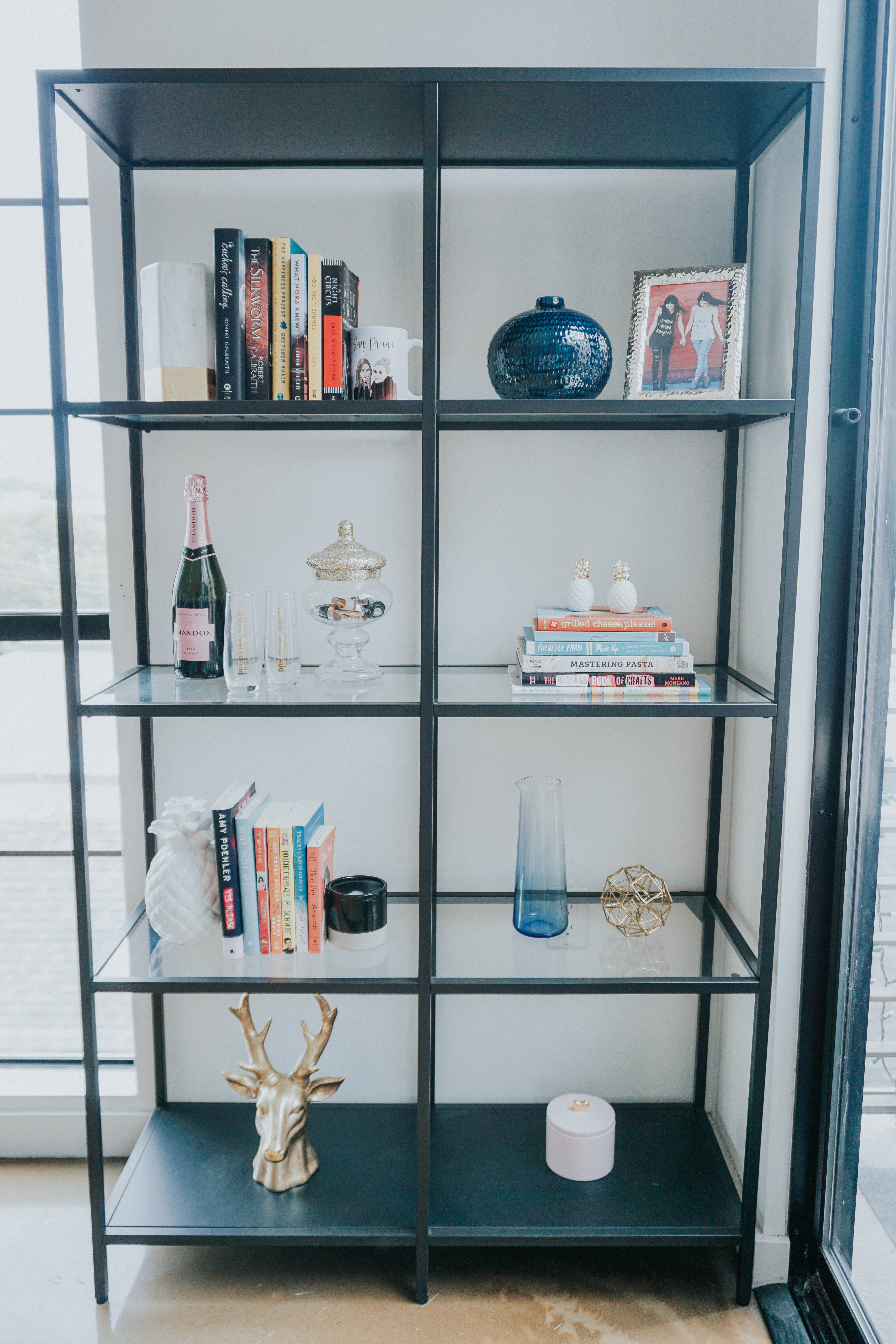
The first thing we did start fresh was de-clutter and reorganize our bookshelf. We got this bookshelf from IKEA when we first moved in and kind of just threw all our books on there. We were literally using odds and ends as bookends for so long. We donated a ton of books that we wouldn’t read again, and stored about 50% of them in our TV cabinet which helped clear up some space. From there we decided which books to pair together and created different blocks amongst the shelf. We absolutely love the champagne area, complete with glasses and bottle stoppers. We also introduced some new items like a this blue vase from CB2 and gold picture frame to compliment other tones in the room.

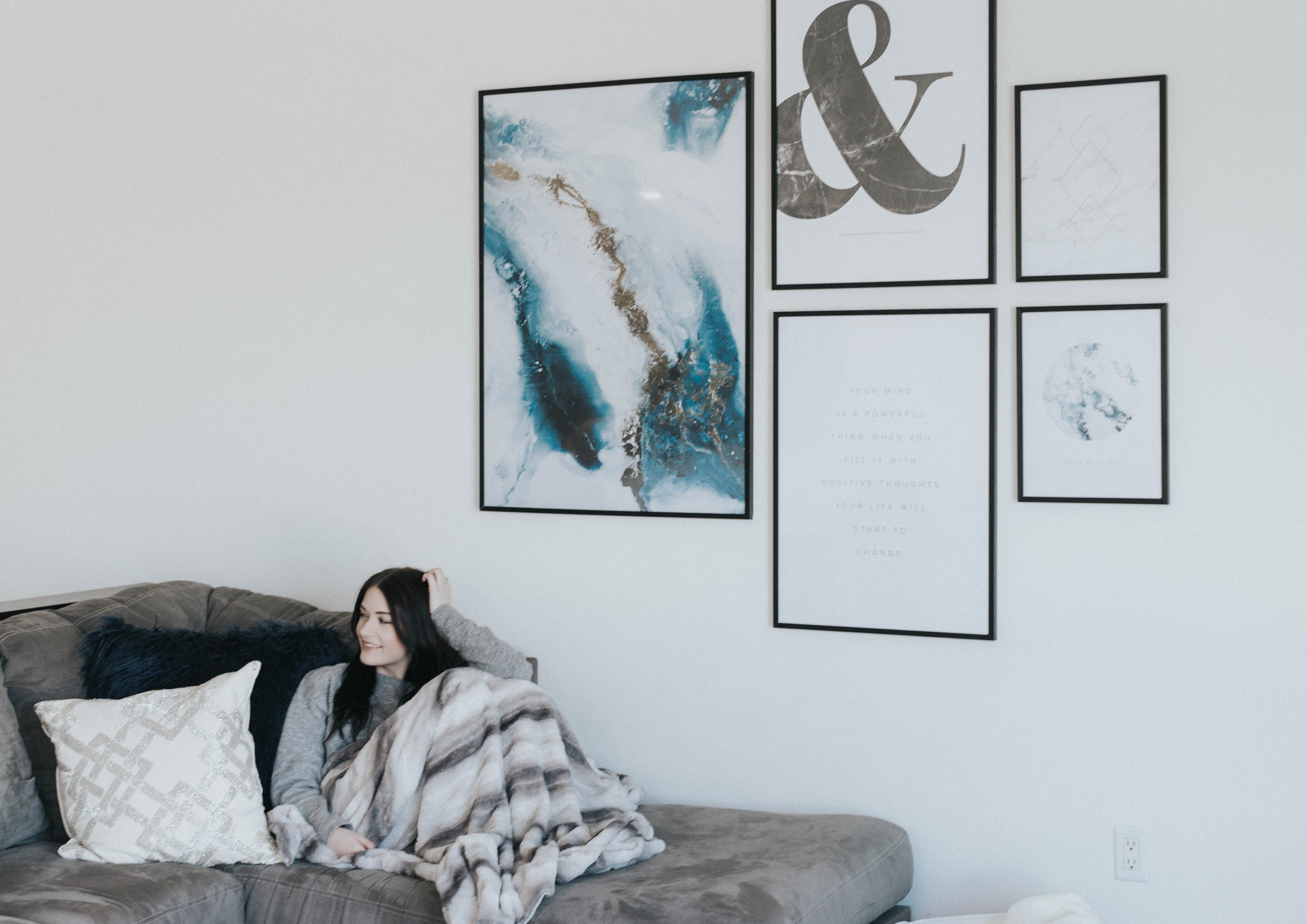
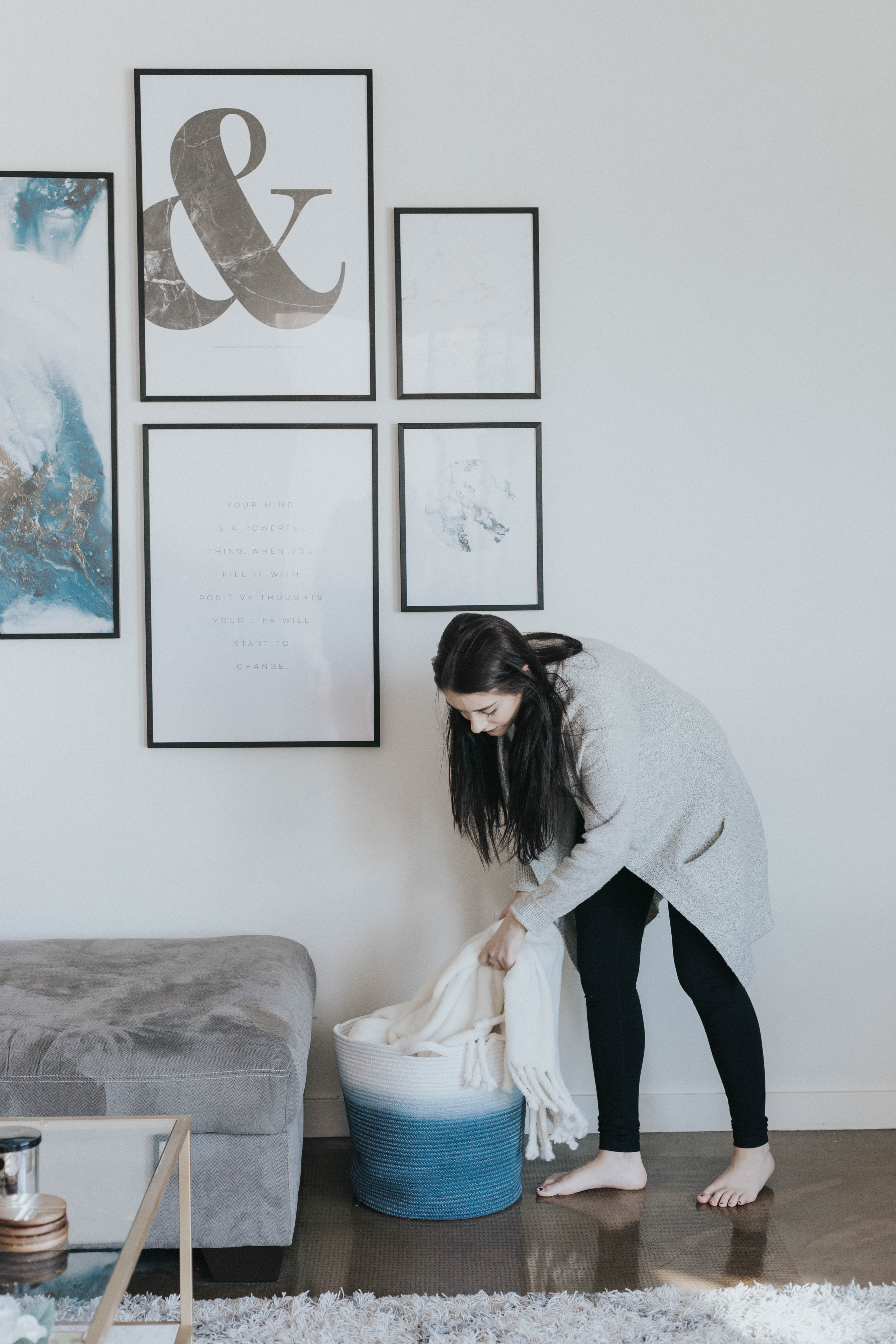
Next we moved onto the wall. We literally purchased a white and gold canvas from Hobby Lobby for like $20, just to have something on the wall. We’d been wanting to jazz up our white wall for awhile but it seemed like a daunting task. That is until Desenio came along. They partnered with us to create a gallery wall that fit our space perfectly. They have a large mix of wall art and posters, all of which compliment each other. We are huge fans of whitespace and the prints we choose had just enough so that the gallery wall didn’t look cluttered.
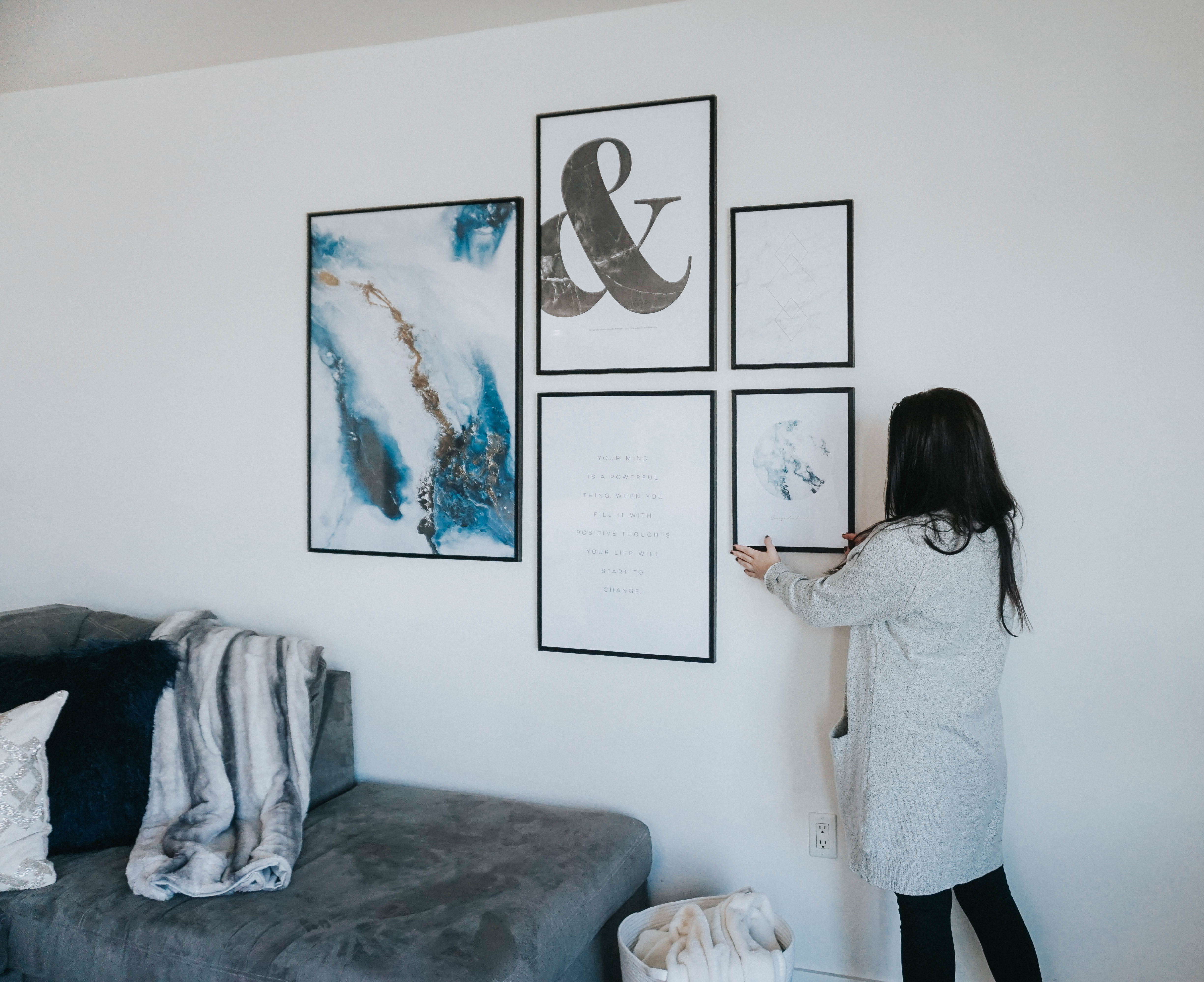
When choosing our prints we decided to create a mock-up in Canva. That way we could see which prints would go where. This helped SO MUCH during the decision process. And when we received the prints we didn’t have to think about where to put them!

Here are the prints we got:
- Into the Blue in size 28×39″
- & Black Marble in size 20×28″
- Your Mind in size 20×28″
- Love at First in size 12×16″
- Triangle Gold Marble in size 12×16″
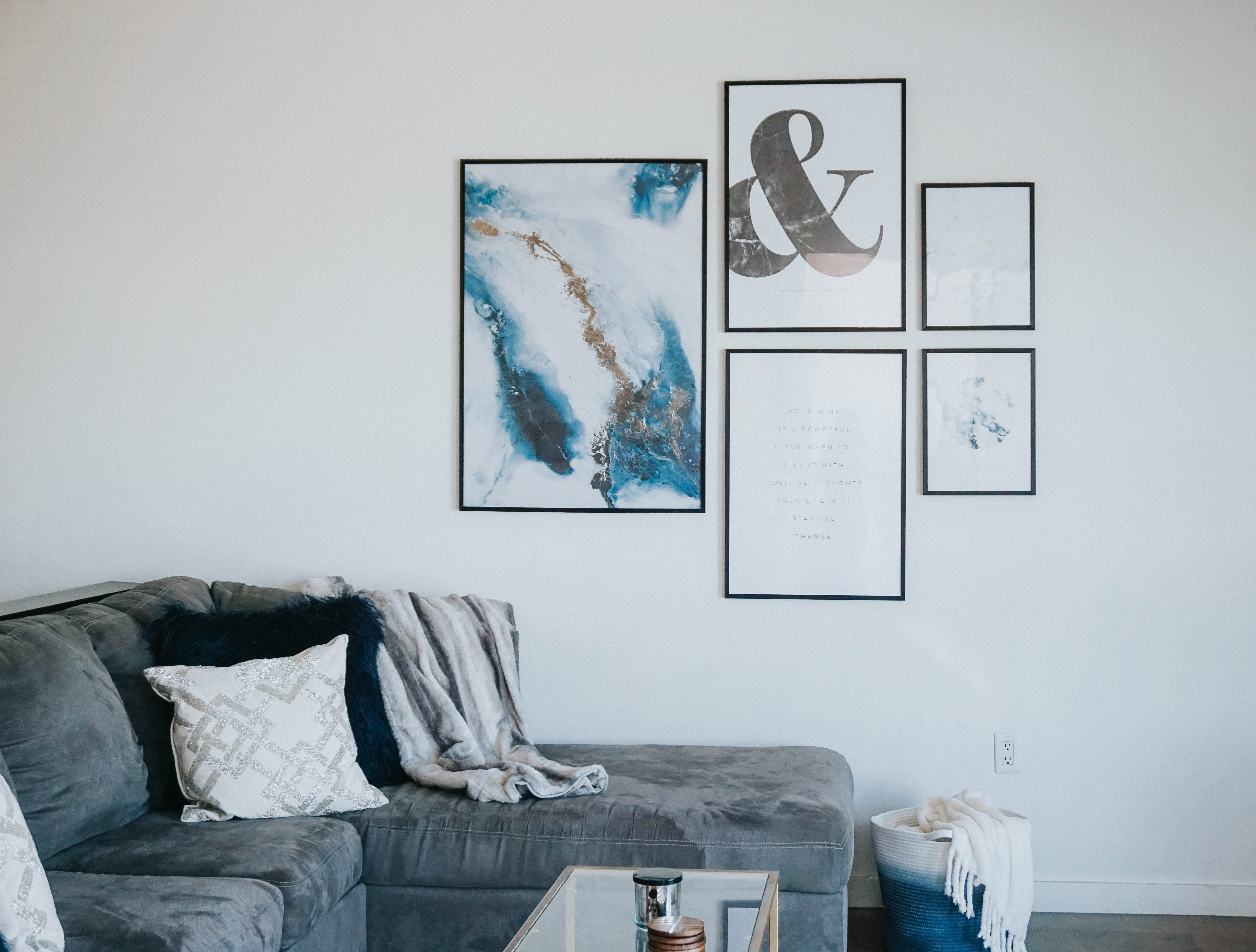
If you’re thinking about creating your own gallery wall head to Desenio and use our code “thegarsowtwins25” to receive 25% off your purchase. The code will work from 02/07-02/09!
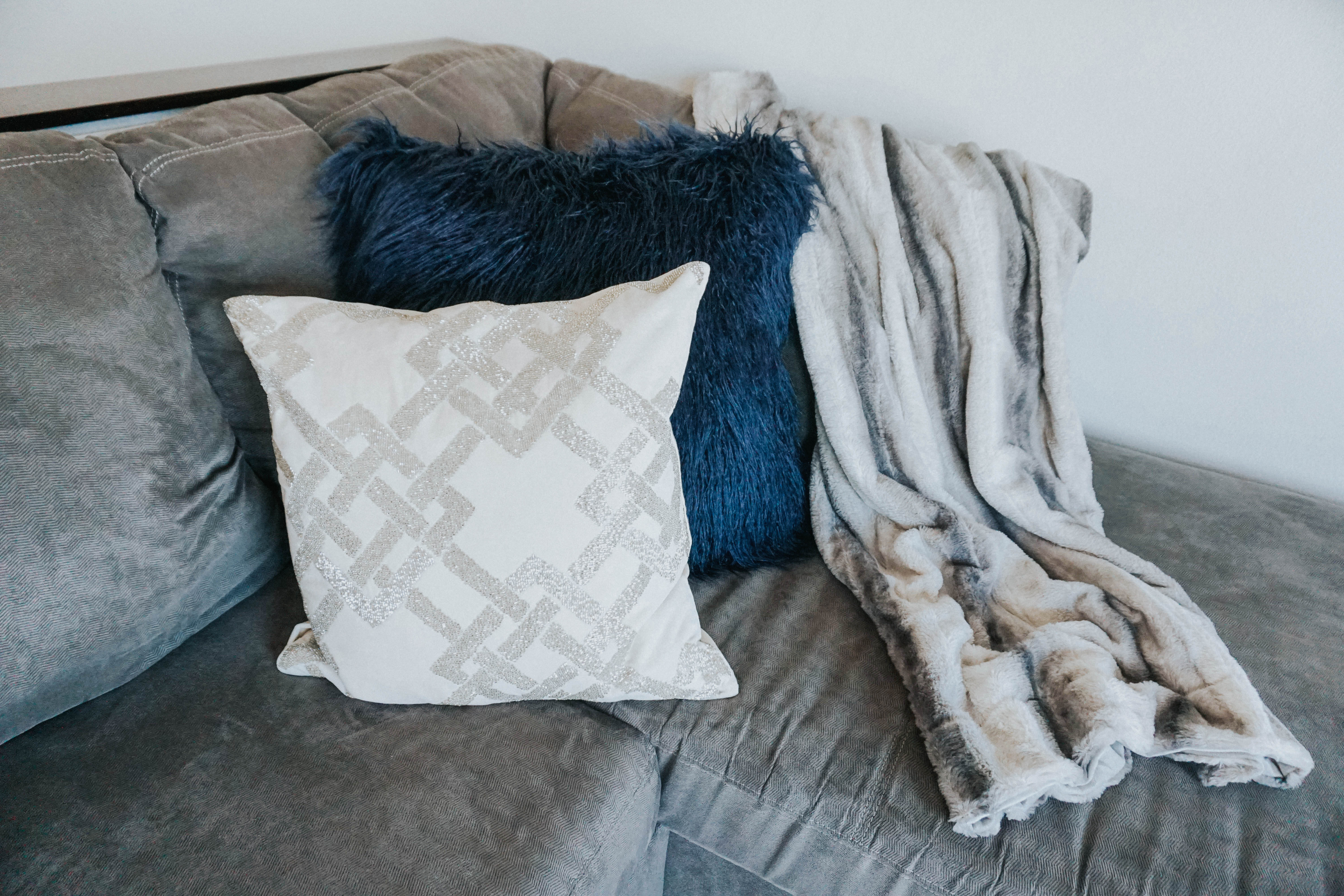
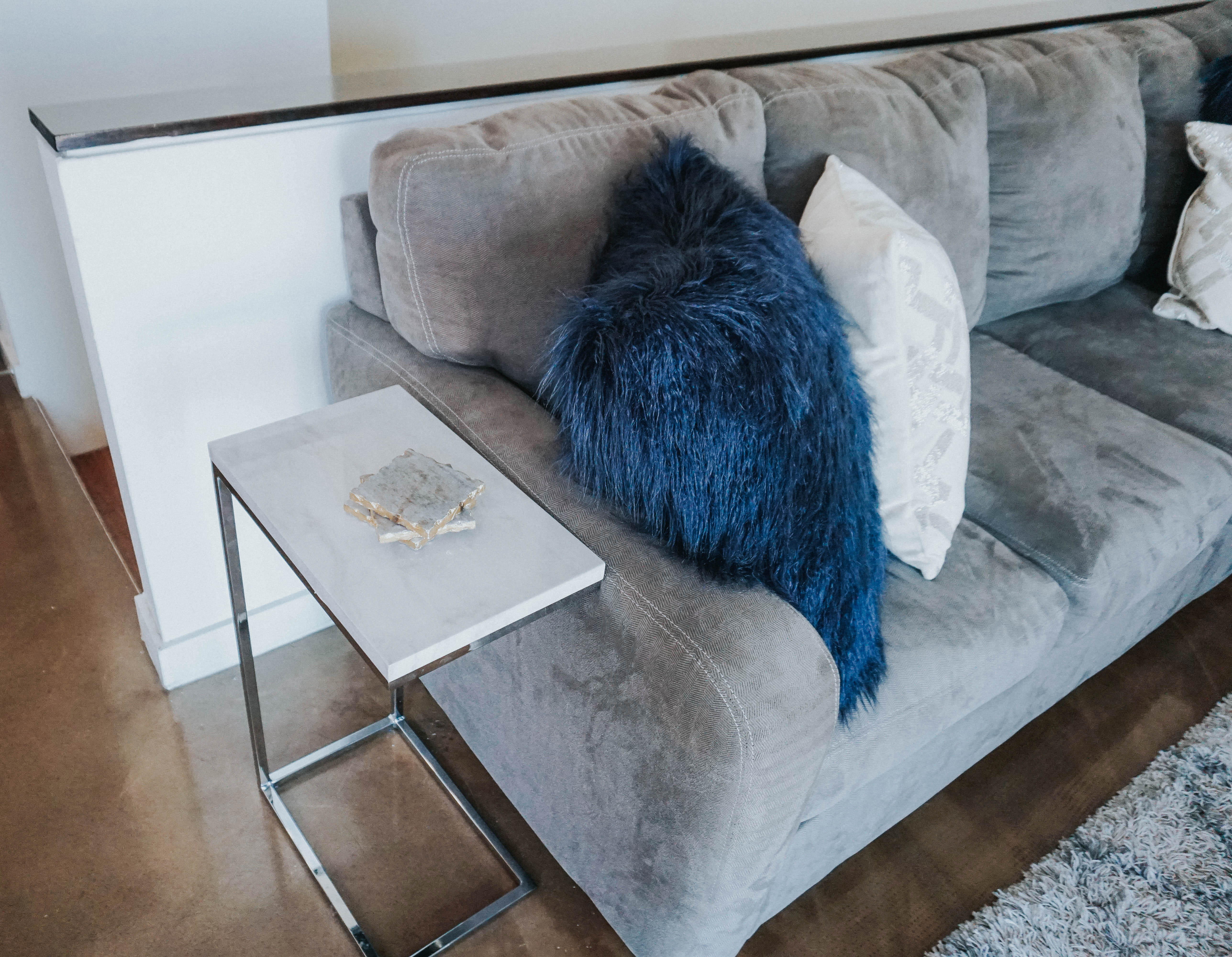
Next up was the couch. Oh the couch. When we first moved in we had a serious couch fiasco. The one we initially purchased was too big for the elevator, so we opted for this smaller couch. None of us really like it at all due to it’s lack of depth but it’s what we have so we decided to jazz it up. We wandered over to HomeGoods and picked up some new throw pillows and a throw blanket. We’ve seen faux fur blankets elsewhere for 4x the price. This one was only $13!! Never in our lives would we have gravitated towards blue faux fur but we really wanted to bring out the blue in the artwork and how comfy do these look?! The white beaded pillows were a total impulse buy because we never buy something just for show, and it’s pretty clear these are decorative pillows. We really wanted to play around with textures to really make the room unique.
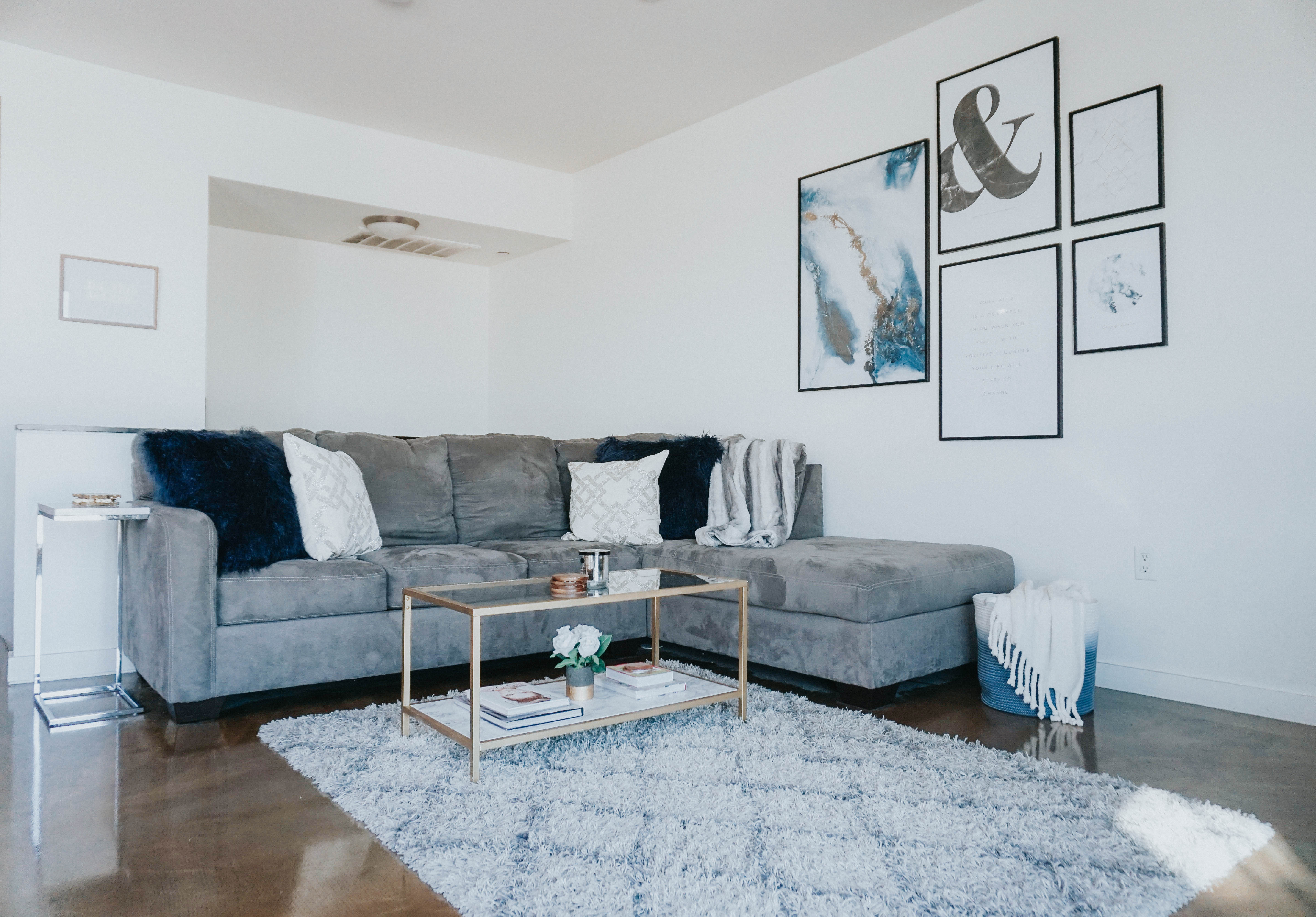
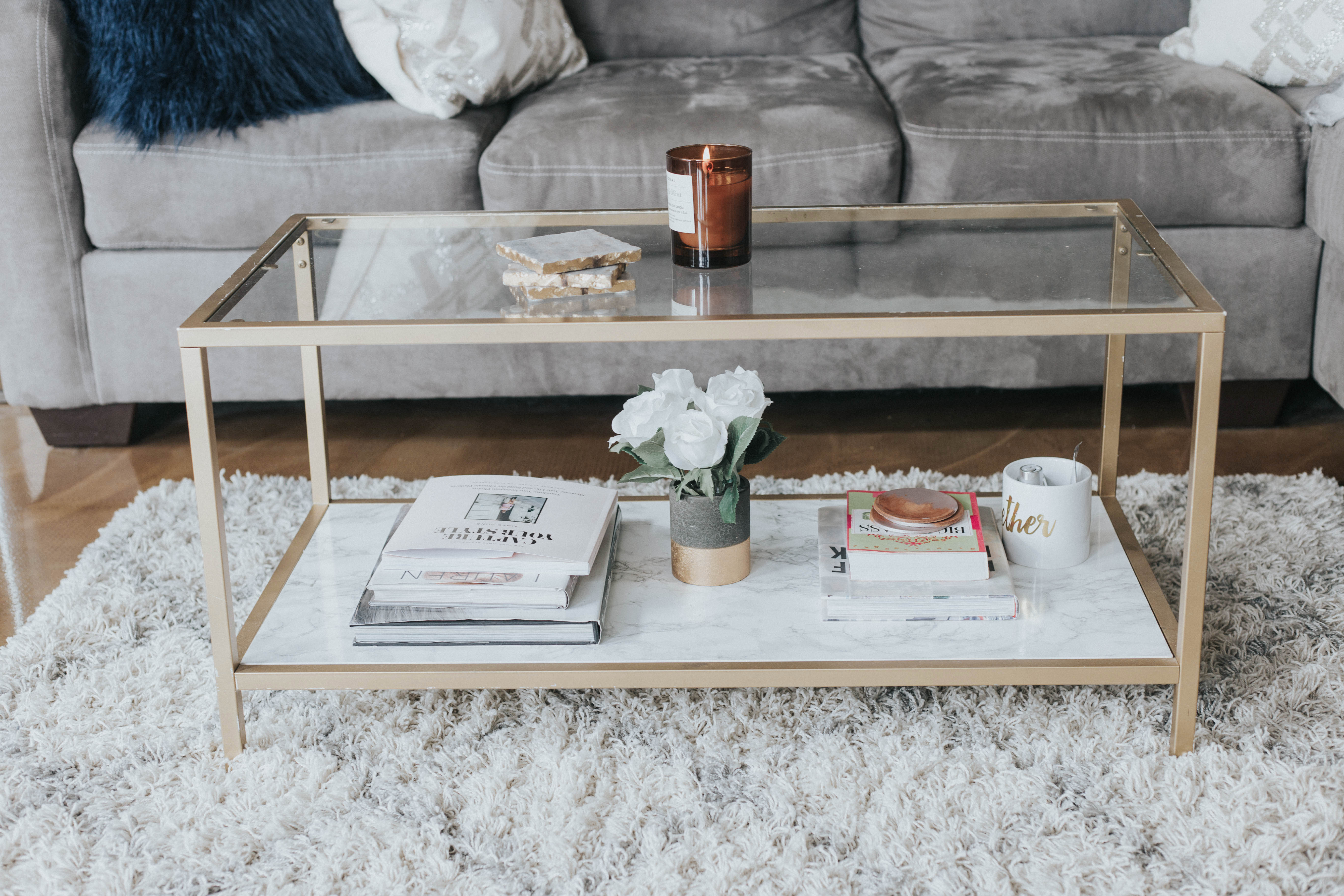
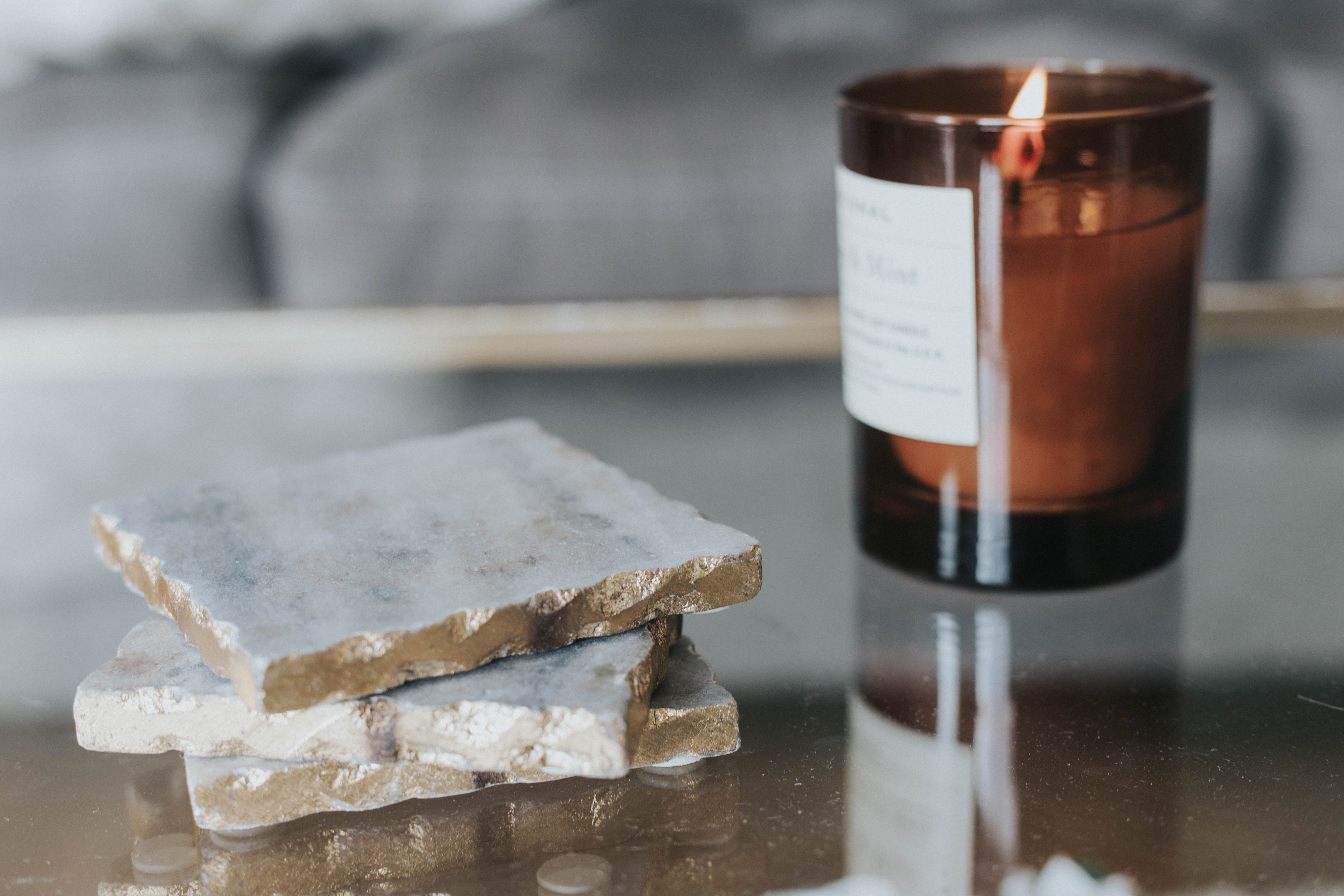
You may have noticed that we also invested in side tables (one isn’t pictured). Since our coach takes up the whole wall we never thought to look for slim side tables, because we didn’t know they existed. You guys already know we’re addicted to marble anything so when we saw these at TJ Maxx we knew we had to have them. They were only $40 a piece and we can move them over the couch if need be. In the future we plan on getting an ottomon to replace our coffee table. That way the four of us can all sit on the couch comfortably. These side tables can be used anywhere on the couch which will almost replace the need for a coffee table! In the meantime we did upgrade to some new coffee table books.
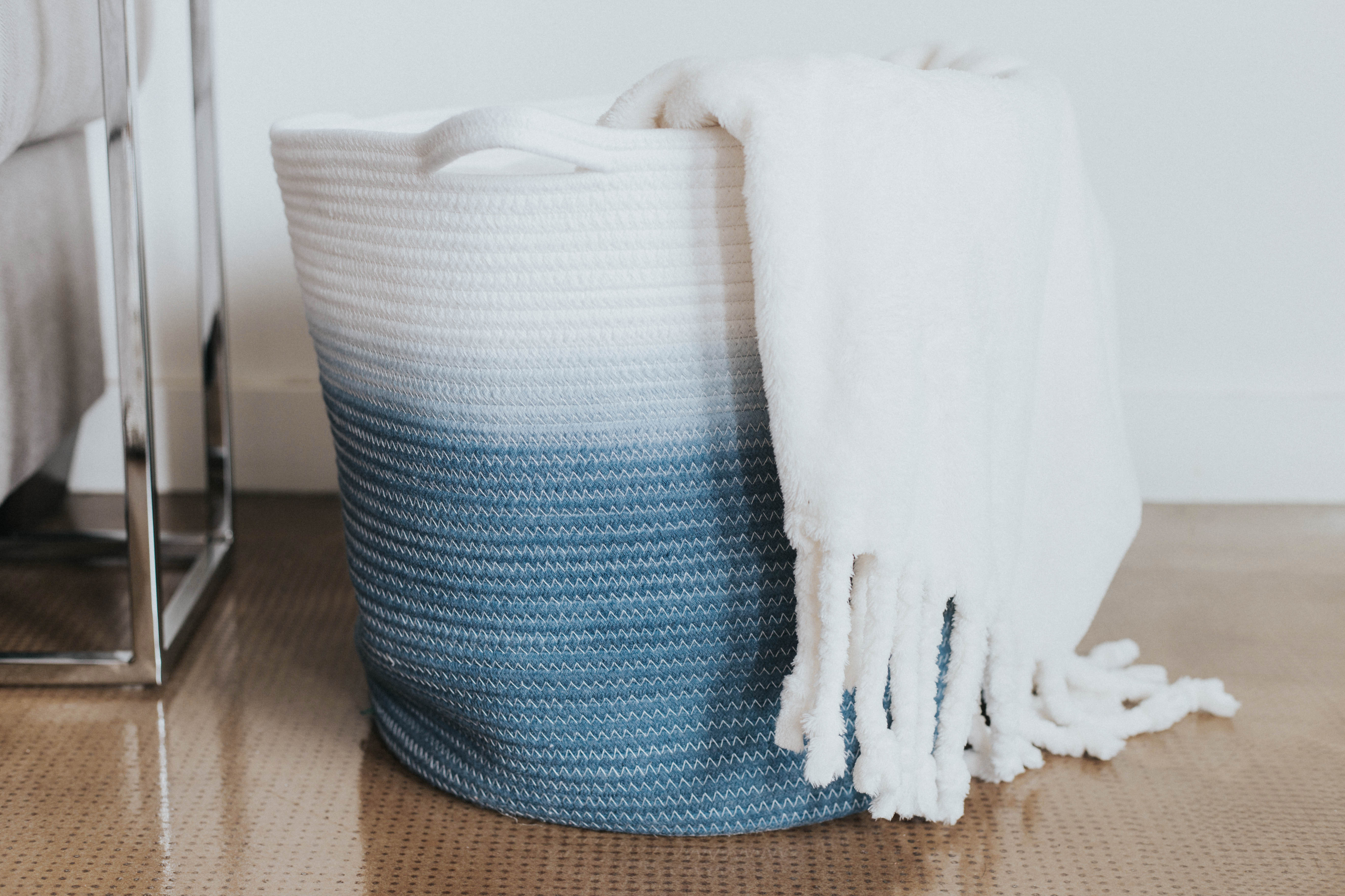
Next we had to get something to hold our throw blankets that blended in a little more. We got this basket at Target and it just so happens our favorite cream throw blankets match the room perfectly!
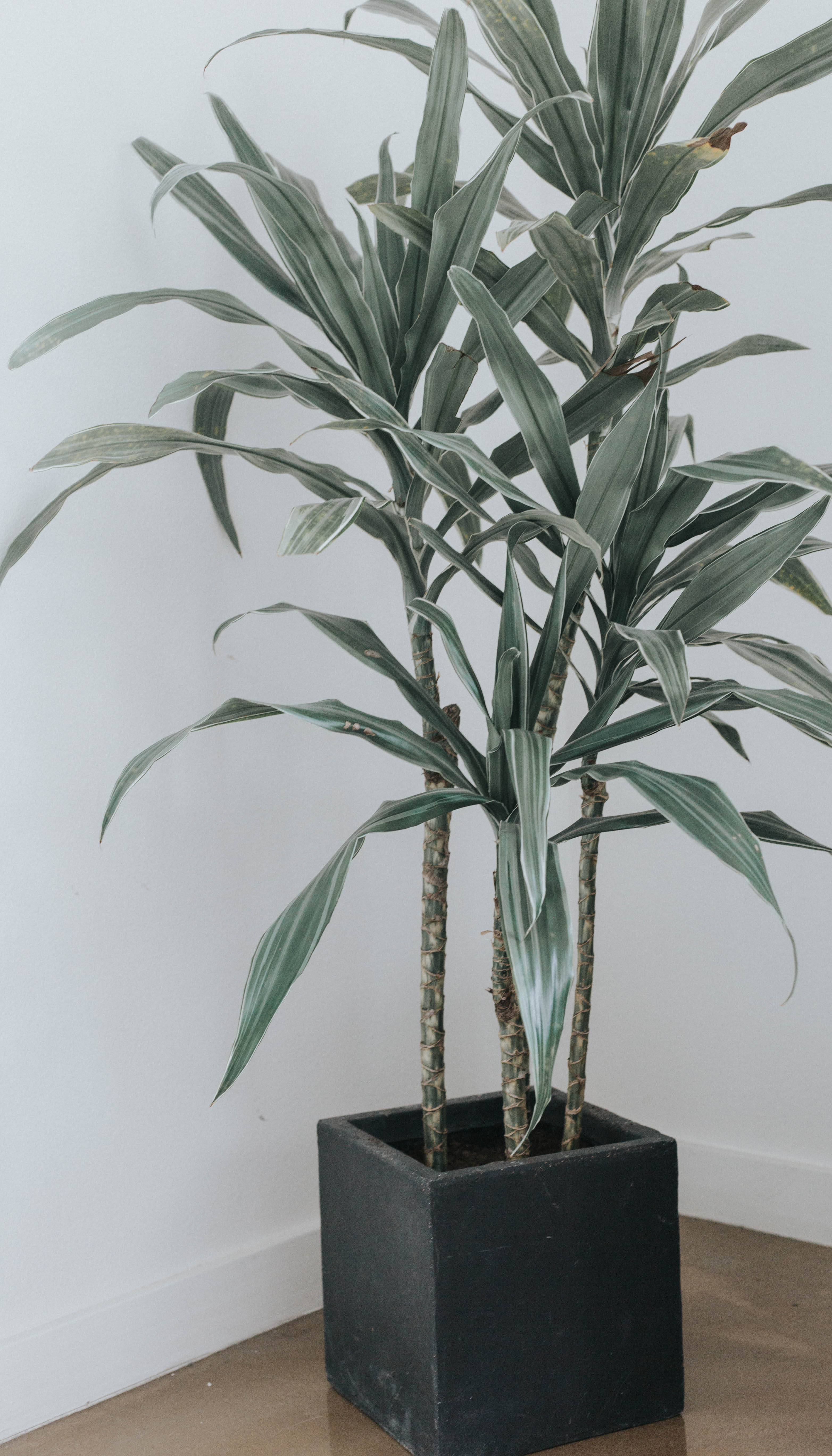
Last but not least we upgraded out plant from a sad, little baby plant to a more adult version. This cement planted just adds more texture to the room and we love the contrast it brings!
We still plan on purchasing a new ottomon and rug but so far we are thrilled with how our revamp turned out! We didn’t need to spend very much money and the room looks completely different.
How would you revamp your living space?
xx, Britta

Your apartment is so adorable! I love the grey with the metallic pops. I’m saving this post in my collection of apartment inspo for when I move this summer.
xo.
http://www.thekristinreview.com
Thanks Kristin! It look us a year to get it looking like this! haha.
I’ll have to keep that in mind. I know I’m going to way it perfect right away!
But that’s not realistic.
OBSESSED with your prints! i also love the frames!
Stunning xxx